DISCLAIMER: I am including links to everything we bought for the remodel, but please note am not getting any kick-back from the manufacturers or stores. The links are just meant to help you source anything you like.
Our bathroom is tiny, but we enjoy the challenge of utilizing every space. The room initially had some spectacular pink swan wallpaper, glass sliding shower doors with bronze accents, a bulky sink cabinet, old fixtures and a vanity. We remove the wallpaper, glass sliding doors and the vanity soon after moving in. I’m sorry to say that we did it so fast that I didn’t even get a picture of the “before” or that fabulous swan wallpaper that will never see the light of day again… But removing those things immediately made the room feel simpler and bigger.
 A major key to homesteading is being efficient with your resources, so we always approach our remodeling projects with energy-efficiency in mind. We chose to replace the older toilet with a high-efficiency dual-flush model from American Standard. Juniper learned which button to push when right off the bat – something I wasn’t sure would come easy to a three year old.
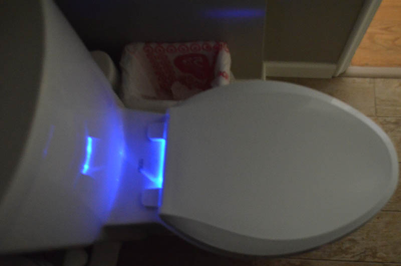 We also installed this super-cool Kohler toilet seat that glows blue! We have it set to turn on at bedtime and it stays on for 7 hours. It has been really great for middle-of-the-night bathroom visits because you don’t need to turn on any lights to find your way around. That’s been handy for a recently potty-trained toddler and me being incredibly pregnant.
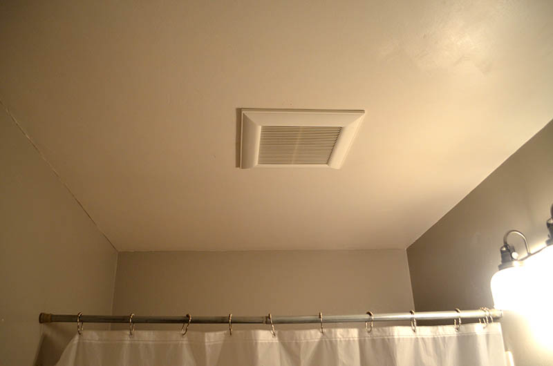 Along the lines of energy-efficiency, we installed a new and super quiet Panasonic bathroom fan. There was no ventilation before, which is a health and safety issue as mold and mildew always appear in those instances. It’s so quiet that even in our small house you can’t hear when the fan is on. That also makes it easy to forget that you left the fan on, so we included the optional timer that automatically turns it off.
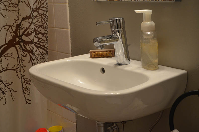 To save space, we ditched the sink and cabinet. I’m a minimalist when it comes to beauty care – no makeup, no hair dryer, no special products. The new Kohler medicine cabinet is enough for our daily needs and everything else gets placed on a shelf in the linen closet just outside the bathroom. The bulky sink setup was replaced with a modern, Duravit wall-hung sink. We chose a modern Grohe faucet to match the modern sink.
 Getting the sink off the floor meant plenty of room for Juniper’s step stool to tuck underneath. With another baby on the way, room for a step stool in the bathroom will be needed for several more years. There is just enough room to set out the essentials on the sink itself – homemade liquid hand soap (used originally as baby wash, but now just as everyday hand soap) and a fingernail brush to get all that dirt off our hands.
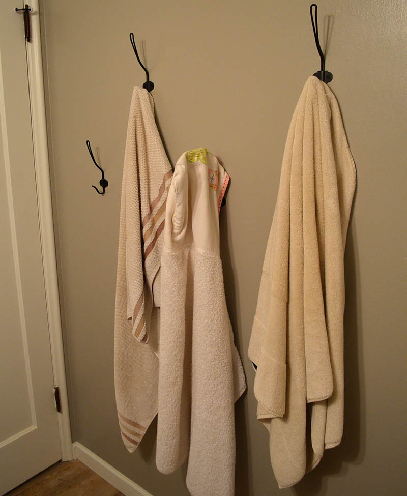 On the opposite wall where the vanity once was, we installed black, old-fashioned hooks from Ikea to hang our bath towels. Called the SVARTSJÖN hook, these added a rustic feel to a room with pretty modern fixtures (sink, faucet, toilet). The hooks are hung at various heights – two taller ones for me and Jay with two smaller ones for Juniper and the baby-on-the-way. It makes use of an other empty space without feeling cramped.
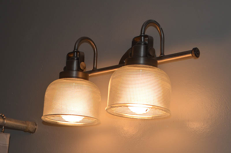 The light fixture is another nod to old-fashioned farmhouse style. We picked an antique nickel finish on this Archie Progress fixture, so it’s not so shiny. The glass has a vintage 1950’s vibe to fit the era as our house. It would be fun to incorporate the other fixtures from this line in our future remodels for continuity.
 We left the original 1950’s tub and you can see the mod-curving shape now that the sink cabinet has been removed. The tree silhouette shower curtain is another small gesture of bringing nature inside around us. The light curtain makes the tub feel less claustrophobic than the former bronze-accented glass sliders.
 The floor ended up being the big feature of the otherwise simple design. I picked Eleganza Patina’s “Cottonwood” porcelain “wood” tile. It has an amazing, aged and weathered look, but since it is tile it can handle bathroom moisture and water spills. It’s not everyone’s cup of tea, but I feel like it balances out the modern fixtures with a strong, rustic character. We bought them in the 4″ x 24″ size from Oregon Tile and Marble.
 The wall color is Metal .04 from Yolo paint – an eco-friendly paint company with VOC-free paints. It’s a medium gray that makes any color in the room really pop. The floor tile looks really warm, fixtures appear perfectly white, linens look extra cozy and other rustic decor items we added, like the old botanical print I framed a few months ago and the vintage wooden shelf, stand out nicely against the grey backdrop. If you are in Portland, you can buy it at Green Depot.
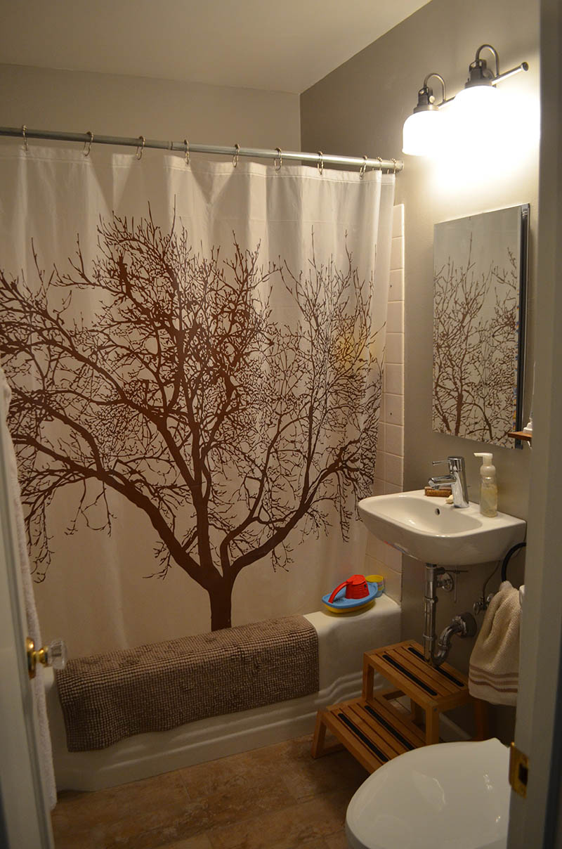 All told, the project cost was about $2,500. My contractor installed the fixtures and floor tile while we did demo and finishes. We saved a lot of money (and some character of the home) by leaving the original 1950’s tub. The room feels exactly like we hoped: rustic, modern with some fun natural elements sprinkled in. Hope it gives you some inspiration for your small spaces!



 This cluster was about the siz


 I start with a


Beautiful, elegant and simple. I love it. I especially love the timber step ups and timber shelf tops, and the shower screen. The only thing I’m not sure about is the sci fi loo look…. but if it saves falls in the night, I’d tollerate it. Thanks for sharing your inspired reno.
I didn’t know about glowing toilets. Now, I really want a glowing toilet.