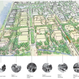
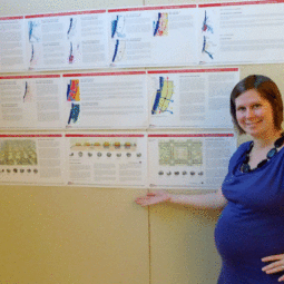
The actual “review” portion is when a professor/professional sits with you for about 30 minutes to discuss your presentation. Everything goes on this one presentation board and you have five minutes to walk them through your project, then head their questions and comments. That part went okay and I think it will help me develop a much thicker skin.
I wanted to share a couple drawings from my presentation that might help us as we design our own garden spaces. The first is a sun-shade-shelter diagram that is really simple to make. Draw out the perimeter of the space you are designing and then draw in the tree canopies, as they will be once fully mature. Then draw a shadow to the north. Stepping back, you can really tell if your space is going to be too exposed or too sheltered. It also helps when you are deciding what trees will be decidious and which ones will be evergreen. I have a few evergreens surrounding the site, but many in the center and southern side are decidious, which allows more light to enter the space in winter.
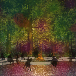
The next drawing is a perspective, which is complicated to draw. But try a rough, informal version. Pick a spot in your garden that you will be relaxing in a lot and draw what you will see from that spot. Is there a huge tree blocking your view? Can you see your new birdbath? Can you see your new favorite perrennial? In the case of the playground, I was trying to determine if parents could always see their children and if there was enough vegetation to fill the space.
Finally, here is the whole presentation board which you are by no means obligated to read and study. But I wanted to share for those who are interested. It’s a lot of work, but I am really enjoying the broad scope of what I am learning here.


 Upgrade your hanging basket game!
  Here’s

 This cluster was about the siz


 I start with a


Domokun!
This is great! I wish they would do more playgrounds like this…they’re much more interesting and intergenerational than the same old playground equipment. I remeber my favorite playground from when I was a kid…it was little more than a sand pit with sculptural, polished concrete forms in them.
Nice Domokuns
Very cool!